Canvas标签是行内元素
canvas标签是行内元素(inline element)。
This is a span text.
canvas {
border: 1px solid gray;
}
span {
width: 200px;
height: 200px;
}
上面两个标签,因为它们均为行内元素,因此都排在同一行上。
一般情况下,行内元素没有宽度与高度。上面的span标签虽已通过CSS为其设置了具体的宽度与高度,但对其行内元素不起作用。
但canvas元素是较为特殊的元素。它虽显示为行内元素(与span排在一行),却是可以有宽度与高度的属性。因此,这是一个inline-block元素。默认情况下,其宽度与高度分别为300px × 150px。
CSS及JavaScript的冲突
在涉及到canvas时,有一个很不容易觉察的问题。
不指定Canvas宽高时的默认值
canvas {
border: 1px solid gray;
}
let canvas = document.getElementById('canvas');
let ctx = canvas.getContext('2d');
console.log('client size: ', canvas.clientWidth, canvas.clientHeight);
console.log('canvas size: ', canvas.width, canvas.height);
JS修改Canvas宽高值
let canvas = document.getElementById('canvas');
let ctx = canvas.getContext('2d');
console.log('before setting: ');
console.log(`client size: ${canvas.clientWidth}, ${canvas.clientHeight}`);
console.log(`canvas size: ${canvas.width}, ${canvas.height}`);
canvas.width = canvas.clientWidth;
canvas.height = canvas.clientHeight;
console.log('after setting: ');
console.log(`client size: ${canvas.clientWidth}, ${canvas.clientHeight}`);
console.log(`canvas size: ${canvas.width}, ${canvas.height}`);
canvas {
border: 1px solid gray;
}
下面根据devicePixelRatio属性值改变:
let canvas = document.getElementById('canvas');
let ctx = canvas.getContext('2d');
console.log('before setting: ');
console.log(`client size: ${canvas.clientWidth}, ${canvas.clientHeight}`);
console.log(`canvas size: ${canvas.width}, ${canvas.height}`);
canvas.width = canvas.clientWidth * devicePixelRatio;
canvas.height = canvas.clientHeight * devicePixelRatio;
console.log('after setting: ');
console.log(`client size: ${canvas.clientWidth}, ${canvas.clientHeight}`);
console.log(`canvas size: ${canvas.width}, ${canvas.height}`);
canvas {
border: 1px solid gray;
}
代码只修改了canvas的width及height属性值,但canvas的clientWidth及clientHeight属性值均发生了变化!这种情况在Safari中出现,但Chrome中未改变。
2025年3月29日,发现Chrome也变为与Safari一样了!
显式地指定Canvas的初始默认值
现在,在canvas的CSS设置中为其显式地设置其width及height属性值。
canvas {
border: 1px solid gray;
width: 300px;
height: 150px;
}
let canvas = document.getElementById('canvas');
let ctx = canvas.getContext('2d');
console.log('before setting: ');
console.log(`client size: ${canvas.clientWidth}, ${canvas.clientHeight}`);
console.log(`canvas size: ${canvas.width}, ${canvas.height}`);
canvas.width = canvas.clientWidth * devicePixelRatio;
canvas.height = canvas.clientHeight * devicePixelRatio;
console.log('after setting: ');
console.log(`client size: ${canvas.clientWidth}, ${canvas.clientHeight}`);
console.log(`canvas size: ${canvas.width}, ${canvas.height}`);
clientWidth及clientHeight属性值没有变化,仅是width及height属性值发生了变化。
也即,在应用devicePixelRatio时,是否显式地设置canvas的CSS的width及height属性值,将导致出现不同的结果!
哪种逻辑正确?canvas在浏览器中的大小应由CSS来设置,我们通过JavaScript代码来设置其width及height的值,目的仅是为了改变清晰度(下节解释),而不应连锁地改变canvas的clientWidth及clientHeight属性值。因此,应通过CSS显式地设置canvas的width及height值。
解决Canvas图像模糊的问题
canvas {
border: 1px solid gray;
width: 600px;
height: 400px;
}
let canvas = document.getElementById('canvas');
let ctx = canvas.getContext('2d');
ctx.clearRect(0, 0, canvas.width, canvas.height);
ctx.fillStyle = '#76CE5D';
ctx.font = '28px Helvetica';
ctx.fillText('Hello, Canvas', 50, 50);
console.log(`client size: ${canvas.clientWidth}, ${canvas.clientHeight}`);
console.log(`canvas size: ${canvas.width}, ${canvas.height}`);
通过CSS将canvas的宽度设置为600px,将高度设置为400px,将导致图像变模糊了。
在console面板中观察clientWidth, clientHeight, width及height的值。CSS的设置将导致canvas的clientWidth属性值变为600px,clientHeight属性值变为400px,但其width的值仍为300px,height的值仍为150px。而canvas的绘图环境ctx只受width及height影响,与clientWidth与clientHeight无关。这样,我们在300px * 150px的范围内绘制图像,其结果最终被拉伸映射至600px * 400px的范围,图像就变得模糊了。
修改上面的CSS宽度值或高度值再重新运行,您会发现,CSS所设置的值越大,映射拉伸越厉害,图像就越模糊。
解决的方法是,在应用CSS样式后,我们应将canvas的width属性值及height属性值与其clientWidth及clientHeight值同步,再调用canvas的getContext方法。
let canvas = document.getElementById('canvas');
canvas.width = canvas.clientWidth;
canvas.height = canvas.clientHeight;
let ctx = canvas.getContext('2d');
ctx.clearRect(0, 0, canvas.width, canvas.height);
ctx.fillStyle = '#76CE5D';
ctx.font = '28px Helvetica';
ctx.fillText('Hello, Canvas', 50, 50);
console.log(`client size: ${canvas.clientWidth}, ${canvas.clientHeight}`);
console.log(`canvas size: ${canvas.width}, ${canvas.height}`);
canvas {
border: 1px solid gray;
width: 600px;
height: 400px;
}
这样就可确保canvas的内部绘图环境ctx的空间大小与canvas在浏览器客户端上的大小完全保持一致,就不会出现图像拉伸问题,从而确保图像清晰。
在高分辨率的设备上使用Canvas
何为高分辨率设备
在Web环境中,全局对象window有一个名为devicePixelRatio的属性,表示硬件设备可用多少个物理像素来绘制一个CSS像素。
可用下面的代码来查看其值:
console.log(window.devicePixelRatio);
或者,在线检测:window.devicePixelRatio = 。
上面的结果是动态检测的结果,不是手工打上去的。因此,不同的设备看到的数值都不一样。值为1,为标准设备。值为2或3,则为高分辨率设备。在购买新设备时,先使用该设备访问本网页,便可知道该显示设备是否高分辨率的显示设备,然后再决定是否购买。
当devicePixelRatio的值为2时,表示您的显示硬件设备可用2个硬件像素来绘制一个CSS像素。使用更多的硬件像素来体现一个CSS像素,将使得图像更加清晰、精细。这就是为何它们被称为高分辨率的原因。Apple公司还为这种设备专门取了一个名字:Retina设备
。好消息是,现在千元以上的手机,大多都具备了这种高分辨率的显示设备。而台式电脑,可能有相当大的一部分仅是标准设备。但,不好说,最好在线检测。
标准设备与高清设备的比较
CSS不会根据devicePixelRatio的值自动改变clientWidth及clientHeight的值。因此,在高分辨率设备上,我们需要将这两个值分别乘以devicePixelRatio的值。
let canvas1 = document.getElementById('canvas-1');
canvas1.width = canvas1.clientWidth;
canvas1.height = canvas1.clientHeight;
let ctx1 = canvas1.getContext('2d');
ctx1.clearRect(0, 0, canvas1.width, canvas1.height);
ctx1.fillStyle = '#76CE5D';
ctx1.font = '28px Helvetica';
ctx1.fillText('Hello, Canvas', 50, 40);
let canvas2 = document.getElementById('canvas-2');
canvas2.width = canvas2.clientWidth * devicePixelRatio;
canvas2.height = canvas2.clientHeight * devicePixelRatio;
let ctx2 = canvas2.getContext('2d');
ctx2.clearRect(0, 0, canvas2.width, canvas2.height);
ctx2.fillStyle = '#76CE5D';
ctx2.font = '28px Helvetica';
ctx2.fillText('Hello, Canvas', 50, 50);
console.log('canvas1:');
console.log(`client size: ${canvas1.clientWidth}, ${canvas1.clientHeight}`);
console.log(`canvas size: ${canvas1.width}, ${canvas1.height}`);
console.log('canvas2:');
console.log(`client size: ${canvas2.clientWidth}, ${canvas2.clientHeight}`);
console.log(`canvas size: ${canvas2.width}, ${canvas2.height}`);
body {
display: flex;
justify-content: flex-start;
gap: 0.5em;
}
canvas {
border: 1px solid gray;
width: 300px;
height: 150px;
}
上面,第一个canvas只使用了原始大小,从而造成高分辨率设备的浪费。而第二个canvas则先将devicePixelRatio的值分别乘以clientWidth及clientHeight的值后,再分别赋值于width及height属性。
第2个canvas的尺寸变大了,但字体却保持不变,也会导致浪费了canvas的丰富的空间。加大第二个canvas上的字体:
let canvas1 = document.getElementById('canvas-1');
canvas1.width = canvas1.clientWidth;
canvas1.height = canvas1.clientHeight;
let ctx1 = canvas1.getContext('2d');
ctx1.clearRect(0, 0, canvas1.width, canvas1.height);
ctx1.fillStyle = '#76CE5D';
ctx1.font = '28px Helvetica';
ctx1.fillText('Hello, Canvas', 50, 40);
let canvas2 = document.getElementById('canvas-2');
canvas2.width = canvas2.clientWidth * devicePixelRatio;
canvas2.height = canvas2.clientHeight * devicePixelRatio;
let ctx2 = canvas2.getContext('2d');
ctx2.clearRect(0, 0, canvas2.width, canvas2.height);
ctx2.fillStyle = '#76CE5D';
ctx2.font = '84px Helvetica';
ctx2.fillText('Hello, Canvas', 50, 100);
console.log('canvas1:');
console.log(`client size: ${canvas1.clientWidth}, ${canvas1.clientHeight}`);
console.log(`canvas size: ${canvas1.width}, ${canvas1.height}`);
console.log('canvas2:');
console.log(`client size: ${canvas2.clientWidth}, ${canvas2.clientHeight}`);
console.log(`canvas size: ${canvas2.width}, ${canvas2.height}`);
body {
display: flex;
justify-content: flex-start;
gap: 0.5em;
}
canvas {
border: 1px solid gray;
width: 300px;
height: 150px;
}
字体变大了,但这回却不存在图像从小被拉伸至较大的情况,因此图像依旧十分清晰。这就是高分辨率的好处:如果我们保留原来的字体大小,则可在相同区域内绘制更多图像;如果我们选择占用更多空间,则图像变得更大,但又保持了高度清晰。
统一应对标准设备与高清设备
统一应对的原理
对于特定的绘制代码,若要在标准设备与高清设备中实现相同的大小,只需将相应的参数都乘以devicePixelRatio即可。
let canvas1 = document.getElementById('canvas-1');
canvas1.width = canvas1.clientWidth;
canvas1.height = canvas1.clientHeight;
let ctx1 = canvas1.getContext('2d');
ctx1.clearRect(0, 0, canvas1.width, canvas1.height);
ctx1.fillStyle = '#76CE5D';
ctx1.fillRect(10, 10, 100, 100);
console.log(CanvasRenderingContext2D);
let canvas2 = document.getElementById('canvas-2');
canvas2.width = canvas2.clientWidth * devicePixelRatio;
canvas2.height = canvas2.clientHeight * devicePixelRatio;
let ctx2 = canvas2.getContext('2d');
ctx2.clearRect(0, 0, canvas2.width, canvas2.height);
ctx2.fillStyle = '#76CE5D';
ctx2.fillRect(10 * devicePixelRatio, 10 * devicePixelRatio, 100 * devicePixelRatio, 100 * devicePixelRatio);
body {
display: flex;
justify-content: flex-start;
gap: 0.5em;
}
canvas {
border: 1px solid gray;
width: 300px;
height: 150px;
}
上面代码的最核心部分:
ctx2.fillRect(10 * devicePixelRatio, 10 * devicePixelRatio, 100 * devicePixelRatio, 100 * devicePixelRatio);
知晓了原理,但如何让各个类型为数值的参数自动地与devicePixelRatio相乘?
共有三种方法。第一种方法是使用JavaScript中的Proxy技术。第二种方法是通过prototype来重新定义相关方法。第三种方法是通过scale变换。
使用Proxy技术
function getCtxProxy(canvas) {
canvas.width = canvas.clientWidth * devicePixelRatio;
canvas.height = canvas.clientHeight * devicePixelRatio;
let ctx = canvas.getContext('2d');
let handler = {
get(target, prop, receiver) {
const value = target[prop];
if (value instanceof Function) {
return function(...args) {
let newArgs = args.map((element) => {
if (typeof(element) === 'number') {
return element * devicePixelRatio;
}
return element;
});
return value.apply(this === receiver ? target: this, newArgs);
};
}
return value;
},
set(obj, prop, value) {
let newValue = value.replace(/\d+/g, (matched) => {
return parseFloat(matched) * devicePixelRatio;
});
obj[prop] = newValue;
return true;
}
};
return new Proxy(ctx, handler);
}
let canvas1 = document.querySelector('#canvas-1');
let ctx1 = canvas1.getContext('2d');
canvas1.width = canvas1.clientWidth;
canvas1.height = canvas1.clientHeight;
ctx1.fillStyle = 'green';
ctx1.fillRect(10, 10, 100, 100);
ctx1.fillStyle = 'cyan';
ctx1.fillRect(130, 10, 50, 50);
ctx1.textAlign = 'center';
ctx1.textBaseline = 'middle';
ctx1.font = '32px Arial';
ctx1.fillStyle = 'yellow';
ctx1.fillText('Hello', 60, 60);
let canvas2 = document.querySelector('#canvas-2');
let ctx2 = getCtxProxy(canvas2);
ctx2.fillStyle = 'green';
ctx2.fillRect(10, 10, 100, 100);
ctx2.fillStyle = 'cyan';
ctx2.fillRect(130, 10, 50, 50);
ctx2.textAlign = 'center';
ctx2.textBaseline = 'middle';
ctx2.font = '32px Arial';
ctx2.fillStyle = 'yellow';
ctx2.fillText('Hello', 60, 60);
现在,变量ctx实际上已经是CanvasRenderingContext2D的一个代理,当我们调用CanvasRenderingContext2D的任意方法时,我们在代理中都会检查其参数是否有数值类型,若有,则与devicePixelRatio相乘后再返回其值。
同样,对于设置字体大小的代码:
ctx2.font = '32px Arial';
我们通过正则表达式将其中的数字与devicePixelRatio相乘:
let newValue = value.replace(/\d+/g, (matched) => {
return parseFloat(matched) * devicePixelRatio;
});
这样就保证了无论是图形还是文本,其大小都根据devicePixelRatio自动进行了变换。
效果如下:
左边的canvas为标清,右边的为高清。两者使用的代码完全一致,大小完全一致,外观完全一致。但右边的canvas在高分辨率设备下看着更舒服。
使用prototype重新定义
['strokeRect', 'fillRect'].forEach(methodName => {
if (!CanvasRenderingContext2D.prototype[methodName].isRedefined) {
let _innerMethod = CanvasRenderingContext2D.prototype[methodName];
CanvasRenderingContext2D.prototype[methodName] = function(...args) {
_innerMethod.apply(this, args.map(arg => arg * devicePixelRatio));
CanvasRenderingContext2D.prototype[methodName].isRedefined = true;
};
}
});
let canvas = document.getElementById('myCanvas');
canvas.width = canvas.clientWidth * window.devicePixelRatio;
canvas.height = canvas.clientHeight * window.devicePixelRatio;
let ctx = canvas.getContext('2d');
ctx.strokeStyle = 'yellow';
ctx.strokeRect(10, 10, 280, 130);
ctx.fillStyle = 'hsla(120, 50%, 50%, 0.3)';
ctx.fillRect(10, 10, 280, 130);
console.log(canvas.width, canvas.height);
canvas {
border: 1px solid gray;
display: block;
margin: 0 auto;
width: 300px;
height: 150px;
}
CSS将canvas的大小定义为300px × 150px。上面两行代码:
ctx.strokeRect(10, 10, 280, 130);
ctx.fillRect(10, 10, 280, 130);
按照CSS所声明的像素来调用这两个方法,渲染效果为全部描边及填充(留边10px)。但实际上,在高分辨率显示设备下,正如Console所显示的,canvas的大小已经实际变为600px × 300px。说明上面两行代码中的参数已自动进行了转换。
核心代码为:
['strokeRect', 'fillRect'].forEach(methodName => {
let _innerMethod = CanvasRenderingContext2D.prototype[methodName];
CanvasRenderingContext2D.prototype[methodName] = function(...args) {
_innerMethod.apply(this, args.map(arg => arg * devicePixelRatio));
CanvasRenderingContext2D.prototype[methodName].isRedefined = true;
};
});
第一,代码:
let _innerMethod = CanvasRenderingContext2D.prototype[methodName];
先将原来的方法留存起来。
第二,利用prototype重新定义方法:
CanvasRenderingContext2D.prototype[methodName] = function(...args) {
_innerMethod.apply(this, args.map(arg => arg * devicePixelRatio));
CanvasRenderingContext2D.prototype[methodName].isRedefined = true;
};
因为我们准备同时重定义strokeRect, fillRect等多个方法,故使用不定长参数...args来接收不同的参数。
第三,通过Array的map方法,将这些参数中的数值逐个都与devicePixelRatio相乘,然后再通过_innerMethod.apply方法来调用原来留存的方法。不能直接调用,否则会造成无限嵌套调用而死锁。因为map方法返回数组,故调用了apply方法而不是call方法。
第四,因为每次调用时,都与devicePixelRatio相乘,当我们重复按下Run按钮时,将导致累积地相乘。因此,只能进行一次转换。故此,在第一次转换时,我们通过为各个方法设置一个isRedefined属性来记录是否已经进行重新定义。
第五,如果已经重新定义,则不再重定义:
['strokeRect', 'fillRect'].forEach(methodName => {
if (!CanvasRenderingContext2D.prototype[methodName].isRedefined) {
let _innerMethod = CanvasRenderingContext2D.prototype[methodName];
CanvasRenderingContext2D.prototype[methodName] = function(...args) {
_innerMethod.apply(this, args.map(arg => arg * devicePixelRatio));
CanvasRenderingContext2D.prototype[methodName].isRedefined = true;
};
}
});
与使用Proxy的方式相比,使用prototype来重新定义的方式更简便,代码更好维护。
需提出的是,不仅CanvasRenderingContext2D的相关方法需重新定义,Path2D的各个方法也需如此重新定义。
使用Scale变换
第三种方法最简单,通过调用ctx的scale方法即可。
let canvas = document.getElementById('myCanvas');
canvas.width = canvas.clientWidth * devicePixelRatio;
canvas.height = canvas.clientHeight * devicePixelRatio;
let ctx = canvas.getContext('2d');
ctx.scale(devicePixelRatio, devicePixelRatio);
const PADDING = 10;
ctx.strokeStyle = 'yellow';
ctx.strokeRect(PADDING, PADDING, canvas.clientWidth - PADDING * 2, canvas.clientHeight - PADDING * 2);
ctx.fillStyle = 'hsla(120, 50%, 50%, 0.3)';
ctx.fillRect(PADDING, PADDING, canvas.clientWidth - PADDING * 2, canvas.clientHeight - PADDING * 2);
ctx.font = '72px Helvetica';
ctx.fillStyle = 'springgreen';
ctx.textAlign = 'center';
ctx.textBaseline = 'middle';
ctx.fillText('Hello', 150, 100);
canvas {
border: 1px solid gray;
display: block;
margin: 0 auto;
width: 300px;
height: 200px;
}
关键代码:
ctx.scale(devicePixelRatio, devicePixelRatio);
我们好好捋一下:
首先,一开始时,canvas的宽度与高度经CSS设置后分别为300px及200px。
之后,为使用高分辨率,canvas的宽度与高度分别与devicePixelRatio(假设其值这里为2)相乘而成为600px及400px。因此,要绘制一个铺满整个canvas区域的长方形,需使用以下代码:
ctx.strokeRect(0, 0, 300 * 2, 200 * 2);
因此,直到这一步,我们在调用ctx的相应方法来绘制图形时,需自己计算实际的大小。有点不方便。
接着,我们对ctx进行了缩放:
ctx.scale(devicePixelRatio, devicePixelRatio);
这意味着,ctx的内部将自动扩大2倍。对ctx的各个方法所传入的参数值,也将自动扩大2倍。因此,此时若要铺满整个canvas区域,只需:
ctx.strokeRect(0, 0, 300, 200);
就行了。因为放大了devicePixelRatio倍,在指定坐标值时,我们退回到了以CSS像素为准的计量单位。也就是说,当我们同时设置了以下两步:
// 1st step
canvas.width = canvas.clientWidth * devicePixelRatio;
canvas.height = canvas.clientHeight * devicePixelRatio;
// 2nd step
ctx.scale(devicePixelRatio, devicePixelRatio);
后,如果需要在canvas上进行定位时,应重新以其clientWidth及clientHeight为标准了。一切都照旧,如同devicePixelRatio根本就不存在一样。
这种情况下,唯独不能直接使用width及height属性值了,这两个值确实翻倍了,可视为在内部提高了精密度,但仅此而已,不要再依据它们进行定位。如,我们想将当前位置移至canvas的中心,此时应使用下面的代码:
// previous setting
ctx.scale(devicePixelRatio, devicePixelRatio);
ctx.moveTo(canvas.clientWidth / 2, canvas.clientHeight / 2);
清屏
let canvas = document.getElementById('myCanvas');
canvas.width = canvas.clientWidth * devicePixelRatio;
canvas.height = canvas.clientHeight * devicePixelRatio;
let ctx = canvas.getContext('2d');
ctx.scale(devicePixelRatio, devicePixelRatio);
ctx.fillStyle = '#666';
ctx.fillRect(0, 0, canvas.clientWidth, canvas.clientHeight);
const PADDING = 20;
ctx.clearRect(0 + PADDING, 0 + PADDING, canvas.clientWidth - PADDING * 2, canvas.clientHeight - PADDING * 2);
canvas {
border: 1px solid gray;
display: block;
margin: 0 auto;
width: 300px;
height: 150px;
}
上面代码,在应用了devicePixelRatio后,先以canvas的clientWidth及clientHeight作为参数调用fillRect方法在整个画布填充一个灰色。
然后,同样以canvas的clientWidth及clientHeight作为参数调用clearRect方法,在画布的中间一部分进行清屏。
可见,clearRect方法也会自动应用devicePixelRatio。因此,以canvas的clientWidth及clientHeight作为参数调用clearRect方法即可实现画布的全部清屏。
避免累积的副作用
平移与缩放是累积的,因此,当多次应用平移或缩放时,将产生累积的副作用。为避免累积的问题,可在负责渲染的函数中先调用ctx的save方法保存其状态,然后应用平移及缩放再绘制图形,最后调用restore方法恢复其状态。
function render() {
ctx.save();
ctx.clearRect(0, 0, canvas.clientWidth, canvas.clientHeight);
ctx.translate(0.5, 0.5);
ctx.scale(1.2, 1.2);
// do drawing
...
ctx.restore();
}
在render函数的一开始,先保存ctx的状态,渲染完毕后,再恢复其状态。这样,如果因程序逻辑所需,多次调用render函数时,一开始的状态始终是未应用任何平移或缩放的状态,从而确保后面的平移或缩放只会应用一次,而不会产生累积的副作用。
这个问题很容易被忽略,从而导致一些不易觉察的bugs,需引起重视。
isPointInPath的小问题
let canvas = document.getElementById('myCanvas');
canvas.width = canvas.clientWidth * devicePixelRatio;
canvas.height = canvas.clientHeight * devicePixelRatio;
let ctx = canvas.getContext('2d');
ctx.scale(devicePixelRatio, devicePixelRatio);
ctx.beginPath();
ctx.moveTo(0, 0);
ctx.lineTo(0, 100);
ctx.lineTo(150, 100);
ctx.lineTo(150, 0);
ctx.closePath();
ctx.strokeStyle = 'plum';
ctx.stroke();
canvas.addEventListener('mousemove', (evt) => {
let output = document.querySelector('output');
output.textContent = `${evt.offsetX}, ${evt.offsetY}`;
let x = evt.offsetX * devicePixelRatio;
let y = evt.offsetY * devicePixelRatio;
if (ctx.isPointInPath(x, y)) {
output.style = 'color: green;';
} else {
output.style = 'color: red;';
}
});
output {
position: absolute;
top: 0;
left: 0;
}
canvas {
border: 1px solid gray;
display: block;
margin: 0 auto;
width: 300px;
height: 200px;
}
当鼠标在canvas上移动时,左上角显示鼠标在canvas的位置。如果鼠标位于绘制的图形内,则显示绿色;如果鼠标位于图形之外,则显示红色。
我们看到,参数evt所提供的代表鼠标位置的数据以CSS像素为单位,因为evt并不关心谁在监听事件,它更不会因为canvas在监听而帮我们自动转换。因此,我们得自己进行转换:
let x = evt.offsetX * devicePixelRatio;
let y = evt.offsetY * devicePixelRatio;
if (ctx.isPointInPath(x, y)) {
output.style = 'color: green;';
}
对于Path2D类也是同样如此。
监听devicePixelRatio的变化
当我们放大、缩小网页,或是将移动设备竖放或横放时,将导致devicePixelRatio的值也会发生变化。我们可以使用matchMedia方法来获取相应的媒介查询,并在此基础上监听其值的变化。
(function onMediaQueryChanged(evt) {
let newMqStr = `(resolution: ${devicePixelRatio}dppx)`;
let media = matchMedia(newMqStr);
media.addEventListener('change', onMediaQueryChanged, {once: true});
document.querySelector('#dpr-output').innerText = devicePixelRatio;
drawOnCanvas();
})();
上面代码的要点在于每次监听的媒介都不一样。例如,在一些标准设备上,devicePixelRatio的初始值为1。这时我们应监听(resolution: 1dppx)
。而当其值改变为2后,我们应重新监听(resolution: 2dppx)
,如此等等。因此上面的代码的addEventListener都有一个{once: true}的选项,用完即弃,然后再重新监听新值。下面是drawOnCanvas的代码:
function drawOnCanvas() {
let canvas = document.getElementById('myCanvas');
canvas.width = canvas.clientWidth * devicePixelRatio;
canvas.height = canvas.clientHeight * devicePixelRatio;
let ctx = canvas.getContext('2d');
ctx.scale(devicePixelRatio, devicePixelRatio);
const PADDING = 10;
ctx.strokeStyle = 'yellow';
ctx.strokeRect(PADDING, PADDING, canvas.clientWidth - PADDING * 2, canvas.clientHeight - PADDING * 2);
ctx.fillStyle = 'hsla(120, 50%, 50%, 0.3)';
ctx.fillRect(PADDING, PADDING, canvas.clientWidth - PADDING * 2, canvas.clientHeight - PADDING * 2);
ctx.font = '72px Helvetica';
ctx.fillStyle = 'springgreen';
ctx.textAlign = 'center';
ctx.textBaseline = 'middle';
ctx.fillText('Hello', 150, 100);
}
查看单页应用的效果。
在下面几种情况下可导致devicePixelRatio发生变化:
- 缩放页面字体大小时
- 从竖屏与横屏状态相互切换时
- 在自响应模式下切换不同的模拟设备时
无论devicePixelRatio如何变化,也无论是否有高分辨率设备,字体大小所占比例均完全一样。
注意上面的代码,并没有清屏的代码,但却获得了自动清屏并重绘的效果,并且毫无闪烁之感。这应该是各浏览器均自动实现了离屏缓冲区的结果。
小结
本站的geoGrp使用用户自定义坐标系则是以另一种方式完美地解决了此问题。但作为Canvas 2D的参考文档,应尽可能如实地使用原有的APIs。
由于Canvas 2D的规范尚未对如何使用高分辨率设备作为规定,导致各浏览器对此没有直接的技术支持,从而导致我们走了许多弯路。由此可见Web标准的重要性。
微软的IE当初与Netscape争得何比激烈,并成功地将Netscape驱离了市场。但为何获胜后最终还是退出了市场?原因是其太狂妄了,在获胜后居功自傲,完全漠视Web标准,最终被市场无情抛弃。而Netscape却转型为Mozilla,至今成长为浏览器领域中的翘楚。
三十年河东,三十年河西,世事难料。唯有不断进取,独善其身,才是王者之道。
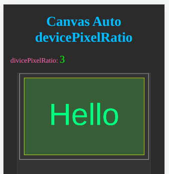
两套尺寸大小的最终解决方案
如前所述,canvas的clientWidth及clientHeight是只读属性,决定了canvas在HTML中物理尺寸大小。而width及height属性决定了绘图环境的大小。
而当我们手工设置width及height的属性值时,Chrome及Safari均隐式地依赖于用户之前是否通过CSS设置了canvas的尺寸大小:
- 如果未设置,则自动改变clientWidth及clientHeight的值。
- 如果已设置,则保留原来的clientWidth及clientHeight的值。
我们要做到既不随意改动clientWidth及clientHeight的值,又要享受高清分辨率。
let canvas = document.getElementById('myCanvas');
canvas.style.width = canvas.clientWidth + 'px';
canvas.style.height = canvas.clientHeight + 'px';
canvas.width = canvas.clientWidth * devicePixelRatio;
canvas.height = canvas.clientHeight * devicePixelRatio;
let ctx = canvas.getContext('2d');
ctx.scale(devicePixelRatio, devicePixelRatio);
console.log(`client size: `, canvas.clientWidth, canvas.clientHeight);
console.log(`context size: `, canvas.width, canvas.height);
canvas {
border: 1px solid orange;
}
看似画蛇添足的代码:
canvas.style.width = canvas.clientWidth + 'px';
canvas.style.height = canvas.clientHeight + 'px';
的效果等同于通过CSS来显式地设置了其clientWidth及clientHeight的值,从而确保了在后面代码设置了width及height的值后,clientWidth及clientHeight不会随之而改变。
上面CSS
面板中未设置canvas的尺寸大小。运行代码后,client size的值取自默认值而不变,而context size则随着devicePixelRatio而发生变化,从而实现了我们的既定目标。
如果将上面两行代码删除,运行代码,您会发现canvas在HTML中的物理尺寸大小无端地
被拉大了。这就是上面这两行代码的价值所在。
保留上面这两行代码,在CSS
面板中设置canvas的width及height属性值,再次运行代码,则client size的值取自该面板中的值,意味着canvas的物理尺寸大小按我们的意愿进行了设置,而context size的值在此基础上再与devicePixelRatio相乘,符合我们的预期。
这样,不管我们是否通过CSS对canvas的width及height属性值进行设置,结果都会完全一致。
本站的CanvasEditor内部采取了这种机制。
