CSS Animations
撰写时间:2024-07-04
修订时间:2025-12-27
基本动画
最小实现
#container {
width: 100vw;
height: 100vh;
box-sizing: border-box;
border: 1px solid tan;
position: relative;
> div {
border: 1px solid gray;
border-radius: 50%;
width: 50px;
height: 50px;
background: green;
position: absolute;
left: 0;
top: 50%;
transform: translate(0%, -50%);
animation-name: moving-right;
animation-duration: 5s;
}
}
@keyframes moving-right {
from {
left: 0;
}
to {
left: 100%;
transform: translate(-100%, -50%);
}
}
关于居中定位的问题。里层div使用了绝对定位的方式,则top: 50%将使其上边框位于外层div的中间的位置,这里的50%是引用了外层div的高度值。因此,若要使里层div真正居中,仍需将其上移自身高度值的一半。而translate函数中的-50%,则是引用了自身的高度。从而实现了精准垂直居中。
animation-name指定要引用的动画关键帧的名称,动画关键帧使用@keyframes前缀来定义。
@keyframes以命名的方式,规范了一组动画。在里面,使用from来指定特定CSS属性在动画开始时的值,使用to来指定特定CSS属性在动画结束时的值。
animation-duration设定动画时长。与animation-name一样,属于不可或缺的基本属性。
动画效果为:在5秒内,向右移动直至顶住右边框。
@keyframes作用域问题
@keyframes的定义是全局性的,因此一般情况下应在全局范围内定义。如果我们希望将特定的关键帧定义限制在特定的选择器中,则在Chrome及Safari中,并不支持在Nested CSS中定义@keyframes。此时,可使用@scope来达到目的。
#container {
width: 100vw;
height: 100vh;
box-sizing: border-box;
border: 1px solid tan;
position: relative;
> div {
border: 1px solid gray;
border-radius: 50%;
width: 50px;
height: 50px;
background: green;
position: absolute;
left: 0;
top: 50%;
transform: translate(0%, -50%);
animation-name: moving-right;
animation-duration: 5s;
}
}
@scope (#container) {
@keyframes moving-right {
from {
left: 0;
}
to {
left: 100%;
transform: translate(-100%, -50%);
}
}
}
animation-delay
animation-delay指定推迟多长时间后再开始播放动画。
#container {
width: 100vw;
height: 100vh;
position: relative;
> div {
border: 1px solid gray;
border-radius: 50%;
width: 50px;
height: 50px;
background: green;
position: absolute;
left: 0;
top: 50%;
transform: translate(0%, -50%);
}
}
div {
animation-name: moving-right;
animation-delay: 1s;
animation-duration: 5s;
}
@keyframes moving-right {
from {
left: 0;
}
to {
left: 46%;
}
}
使用margin来定位的问题
对于块级元素,使用margin-left来往右移动。
div {
border: 1px solid gray;
border-radius: 50%;
width: 50px;
height: 50px;
background: green;
}
div {
animation-name: moving-right;
animation-duration: 5s;
}
@keyframes moving-right {
from {
margin-left: 0px;
}
to {
margin-left: 400px;
}
}
margin-right使元素的右边与其他元素保持一定的间距。但对于块级元素来说,一行只有一个元素,因此对块级元素设置margin-right没有意义。
因此较为方便的方式,是使用绝对定位的方式来进行定位,下面的例子均依此定位。
animation-iteration-count
animation-iteration-count指定该组动画重复的次数。其值可为正整数,或infinite,代表无限次播放。
div {
border: 1px solid gray;
border-radius: 50%;
width: 50px;
height: 50px;
background: green;
position: absolute;
left: 0px;
top: 10px;
}
div {
animation-name: moving-right;
animation-duration: 5s;
animation-iteration-count: 2;
}
@keyframes moving-right {
from {
left: 0px;
}
to {
left: 400px;
}
}
动画效果为:在5秒内,向右移动400px。重复两次该动画。
设定中间关键帧
div {
border: 1px solid gray;
border-radius: 50%;
width: 50px;
height: 50px;
background: red;
position: absolute;
left: 0px;
top: 20px;
}
div {
animation-name: moving-right;
animation-duration: 5s;
animation-iteration-count: 2;
}
@keyframes moving-right {
from {
left: 0px;
background: red;
}
50% {
background: green;
}
to {
left: 400px;
background: blue;
}
}
动画效果为:在5秒内,向右移动400px。开始时的背景颜色为红色,中间的背景颜色为绿色,最后一帧的背景颜色为蓝色。重复两次该组动画。
本例演示了可为多个CSS属性同时设置关键帧;且可以通过百分比的方式,来指定相应位置的关键帧插值。
from与0%的效果一样,to与100%的效果一样。
读者可自行添加25%或75%的关键帧,并观察动画效果。
可为多个关键帧的位置同时设置相同的属性值。
div {
border: 1px solid gray;
border-radius: 50%;
width: 100px;
height: 100px;
background: red;
position: absolute;
left: 10px;
top: 10px;
}
div {
animation-name: change-color;
animation-duration: 5s;
}
@keyframes change-color {
0%, 100% {
background: red;
}
25%, 75% {
background: green;
}
50% {
background: blue;
}
}
这里可看出,CSS动画是基于关键帧的动画。我们只需指定关键帧,电脑会自动添加其余的关键帧插值。这个功能很强大、很实用、很方便。
animation-direction
animation-direction用于设定关键帧的播放顺序。其值有:
- normal
- 正常播放次序
- reverse
- 倒序播放
- alternate
- 奇数时顺序播放,偶数时倒序播放。
- alternate-reverse
- 奇数时倒序播放,偶数时顺序播放。
div {
border: 1px solid gray;
border-radius: 50%;
width: 50px;
height: 50px;
background: cadetblue;
position: absolute;
left: 10px;
top: 10px;
}
div {
animation-name: change-color;
animation-duration: 5s;
animation-direction: reverse;
animation-iteration-count: infinite;
}
@keyframes change-color {
0% {
left: 10px;
}
100% {
left: 400px;
}
}
animation-fill-mode
animation-fill-mode用于设定播放完后的动作。其值有:
- none
- 播放完后,自动回到初始状态再停止。默认值。
- forwards
- 播放完后,在结束状态停止。
- backwards
- 播放完后,自动回到初始状态再停止。
- both
- 同时应用forwards及backwards。
div {
border: 1px solid gray;
border-radius: 50%;
width: 50px;
height: 50px;
background: cadetblue;
position: absolute;
left: 10px;
top: 10px;
}
div {
animation-name: change-color;
animation-duration: 2s;
animation-delay: 1s;
animation-fill-mode: none;
}
@keyframes change-color {
0% {
left: 10px;
}
100% {
left: 400px;
}
}
none与backwards的区别是:当设定了animation-delay时,backwards在此迟延的时间段内,显示第0帧的状态;而none则显示初始状态。
animation-play-state
animation-play-state用于设定动画是正常播放还是暂停。其值有:
- running
- 正常播放。默认值。
- paused
- 暂停播放。
div {
border: 1px solid gray;
border-radius: 50%;
width: 50px;
height: 50px;
background: cadetblue;
position: absolute;
left: 10px;
top: 10px;
}
div {
animation-name: change-color;
animation-duration: 2s;
animation-play-state: paused;
}
@keyframes change-color {
0% {
left: 10px;
}
100% {
left: 400px;
}
}
可使用JavaScript来设置此属性值,可达到随时暂停播放动画的效果。
animation-timing-function
animation-timing-function用以指定是否缓入缓出的效果。其值由CSS Easing Functions Level 1予以规范,共有3种。
线性
linear表示始终以相同的速度来播放整个动画。
div {
border: 1px solid gray;
border-radius: 50%;
width: 50px;
height: 50px;
background: cadetblue;
position: absolute;
left: 0px;
top: 10px;
}
div {
animation-name: change-color;
animation-duration: 2s;
animation-timing-function: linear;
}
@keyframes change-color {
0% {
left: 0px;
}
100% {
left: 400px;
}
}
Cubic Bézier
贝塞尔曲线的值分为:
- ease
- 急进缓出。
- ease-in
- 缓进,然后线性。
- ease-out
- 线性进入,稍微缓出。
- ease-in-out
- 缓进缓出。
- cubic-bezier(<number [0,1]>, <number>, <number [0,1]>, <number>)
- 通过自定义控制贝塞尔曲线的控制点自行控制进入及出去的速度。
前4种示意图如下:
 Cubic bezier easing funcs
X轴为从开始到结束的动画关键帧,Y轴为速度。曲线可看出在各个阶段动画的加速度的情况。曲线越陡峭,说明加速度越大,所需时间越短,动作完成得越快;曲线越平缓,说明加速度越小,所需时间越长,动作完成得越慢。
ease
div {
border: 1px solid gray;
border-radius: 50%;
width: 50px;
height: 50px;
background: cadetblue;
position: absolute;
left: 0px;
top: 10px;
}
div {
animation-name: change-color;
animation-duration: 2s;
animation-timing-function: ease;
}
@keyframes change-color {
0% {
left: 0px;
}
100% {
left: 400px;
}
}
在动画的前半部分,完成速度很快;后面则放缓了加速度。因此ease的效果为快进缓出。其快慢变化的节奏比较明显。
ease-in
div {
border: 1px solid gray;
border-radius: 50%;
width: 50px;
height: 50px;
background: cadetblue;
position: absolute;
left: 0px;
top: 10px;
}
div {
animation-name: change-color;
animation-duration: 2s;
animation-timing-function: ease-in;
}
@keyframes change-color {
0% {
left: 0px;
}
100% {
left: 400px;
}
}
ease-in的效果为先缓进,然后再过渡到线性的平均速度。
ease-out
div {
border: 1px solid gray;
border-radius: 50%;
width: 50px;
height: 50px;
background: cadetblue;
position: absolute;
left: 0px;
top: 10px;
}
div {
animation-name: change-color;
animation-duration: 2s;
animation-timing-function: ease-out;
}
@keyframes change-color {
0% {
left: 0px;
}
100% {
left: 400px;
}
}
ease-out的效果为快进缓出。其快慢变化的节奏不大明显。
ease-in-out
div {
border: 1px solid gray;
border-radius: 50%;
width: 50px;
height: 50px;
background: cadetblue;
position: absolute;
left: 0px;
top: 10px;
}
div {
animation-name: change-color;
animation-duration: 2s;
animation-timing-function: ease-in-out;
}
@keyframes change-color {
0% {
left: 0px;
}
100% {
left: 400px;
}
}
ease-in-out的效果为缓进缓出。这是最符合自然规律的动画节奏。
cubic-bezier函数
div {
border: 1px solid gray;
border-radius: 50%;
width: 50px;
height: 50px;
background: cadetblue;
position: absolute;
left: 0px;
top: 10px;
}
div {
animation-name: change-color;
animation-duration: 2s;
animation-timing-function: cubic-bezier(0.5, 0, 0.2, 1);
}
@keyframes change-color {
0% {
left: 0px;
}
100% {
left: 400px;
}
}
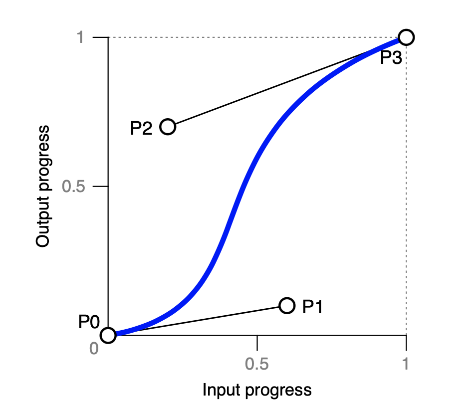 Input-output progress
cubic-bezier的4个参数,用于指定上图中的P1及P2这两个控制点。前两个参数为P1的(x, y)值,后两个参数为P2的(x, y)值。第1及第3个参数的值域须为[0, 1]。
下面的工具可直观地拖出曲线效果。或者访问独立的bezier-curve.html页面。
步进
概述
步进的本质是,通过调用steps函数,CSS引擎可帮我们自动生成多个静止的关键帧。其原理是:
- 将关键帧分为多个阶段,各阶段的速度为0(即该阶段内,起始关键帧的值与结束关键帧的值相同,因此各阶段显示为静止的状态);
- 然后,在阶段时长结束时,不经历任何时间,直接转入下一阶段(跃升);
- 各阶段中关键帧的值依用户所设定的起始关键帧的值与结束关键帧的值自动计算得出。
下图为4种最基本的步进方式:
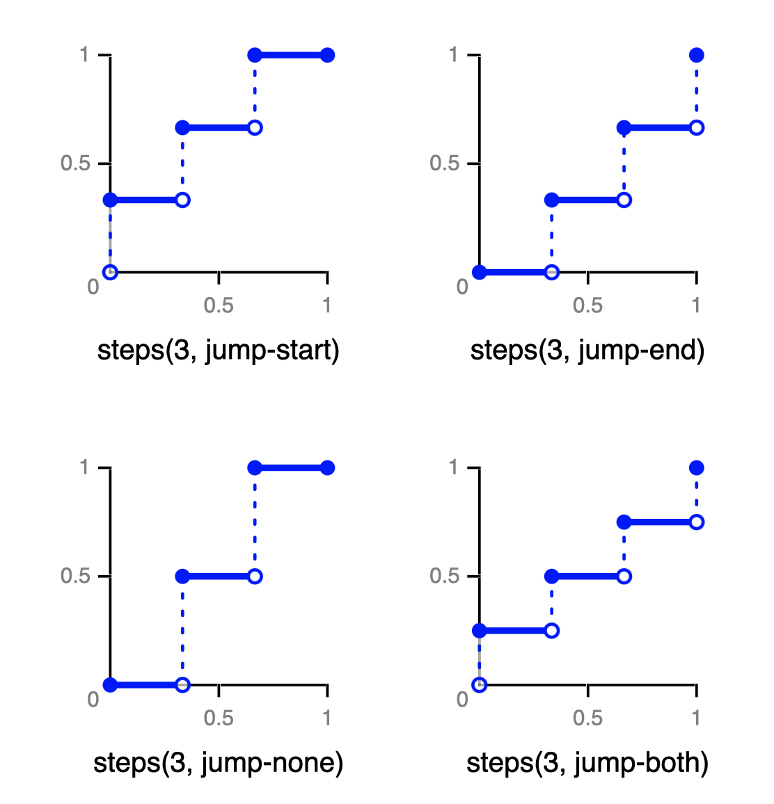 Step easing funcs
我们需要通过调用steps函数来指定:共分为多少个阶段,以及起始阶段及结束阶段是否跃升。各阶段的关键帧插值将自动生成。
step函数的语法为:
steps(<stages>[, <step-position>]?)
参数stages用以指定共分为多少个阶段。参数step-position的值可为:
- jump-start
- 开始时即跃升。
- jump-end
- 结束时跃升。
- jump-none
- 所有跃升均出现在[0, 1]的范围内。
- jump-both
- 开始时即跃升,结束时也跃升。
- start
- 与jump-start一样。
- end
- 与jump-end一样。
下面各节详细说明各个step-position的具体含义。
jump-none
div#container {
position: relative;
#area {
position: absolute;
z-index: 1;
display: flex;
> div {
box-sizing: border-box;
border: 1px solid gray;
width: 150px;
height: 52px;
}
}
}
div#animate {
border: 1px solid gray;
border-radius: 50%;
width: 50px;
height: 50px;
background: cadetblue;
position: absolute;
z-index: 2;
left: 0px;
top: 0px;
}
div#animate {
animation-name: step-jump;
animation-duration: 9s;
animation-iteration-count: infinite;
animation-timing-function: steps(3, jump-none);
}
@keyframes step-jump {
0% {
left: 0px;
}
100% {
left: 300px;
}
}
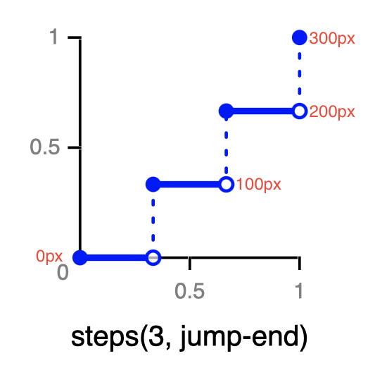
动画区域总长为450,分为3个阶段。第1个阶段将在left: 0px的位置停留3秒,然后直接跳到第2个阶段,在left: 150px的位置停留3秒;最后跳到第3个阶段,在left: 300px的位置停留3秒。
动画最终位置在left: 300px,为何3个方框总长却为450px?
 step-funcs-jump-none
从上图中可看出,动画区域共分为3个阶段,left: 300px的位置位于第3个阶段的开始处,后面还有150px的动画区域,因此总宽度为450px。
对于:
animation-timing-function: steps(3, jump-none);
这一行代码,CSS引擎在后台自动为我们打上了6个关键帧:
@keyframes step-jump {
0%, 33% {
left: 0px;
}
33.01%, 66% {
left: 150px;
}
66.01%, 100% {
left: 300px;
}
}
值33.01%用以将从第1阶段过渡到第2阶段的时长缩减为毫秒级,从而模拟跃升的效果。
这就是steps函数的威力所在。
jump-start (start)
div#container {
position: relative;
#area {
position: absolute;
z-index: 1;
display: flex;
> div {
box-sizing: border-box;
border: 1px solid gray;
width: 100px;
height: 52px;
}
}
}
div#animate {
border: 1px solid gray;
border-radius: 50%;
width: 50px;
height: 50px;
background: cadetblue;
position: absolute;
z-index: 2;
left: 0px;
top: 0px;
}
div#animate {
animation-name: step-jump;
animation-duration: 9s;
animation-iteration-count: infinite;
animation-timing-function: steps(3, jump-start);
}
@keyframes step-jump {
0% {
left: 0px;
}
100% {
left: 300px;
}
}
各阶段关键帧的值如下图:
 step-funcs-jump-start
则将生成对应的关键帧:
@keyframes step-jump {
0%, 33% {
left: 100px;
}
33.01%, 66% {
left: 200px;
}
66.01%, 100% {
left: 300px;
}
}
可见,在开始时,就已经跃升至left: 100px的位置。
start属性值与jump-start属性值一样。
jump-end (end)
div#container {
position: relative;
#area {
position: absolute;
z-index: 1;
display: flex;
> div {
box-sizing: border-box;
border: 1px solid gray;
width: 100px;
height: 52px;
}
}
}
div#animate {
border: 1px solid gray;
border-radius: 50%;
width: 50px;
height: 50px;
background: cadetblue;
position: absolute;
z-index: 2;
left: 0px;
top: 0px;
}
div#animate {
animation-name: step-jump;
animation-duration: 9s;
animation-fill-mode: forwards;
animation-timing-function: steps(3, jump-end);
}
@keyframes step-jump {
0% {
left: 0px;
}
100% {
left: 300px;
}
}
各阶段关键帧的值如下图:
 step-funcs-jump-end
则将生成对应的关键帧:
@keyframes step-jump {
0%, 33% {
left: 0px;
}
33.01%, 66% {
left: 100px;
}
66.01%, 99.99% {
left: 200px;
}
100% {
left: 300px;
}
}
最后一个关键帧,跃升至left: 300px的位置后,立即停止动画。
end属性值与jump-end属性值一样。
jump-both
div#container {
position: relative;
#area {
position: absolute;
z-index: 1;
display: flex;
> div {
box-sizing: border-box;
border: 1px solid gray;
width: 100px;
height: 52px;
}
}
}
div#animate {
border: 1px solid gray;
border-radius: 50%;
width: 50px;
height: 50px;
background: cadetblue;
position: absolute;
z-index: 2;
left: 0px;
top: 0px;
}
div#animate {
animation-name: step-jump;
animation-duration: 9s;
animation-fill-mode: forwards;
animation-timing-function: steps(3, jump-both);
}
@keyframes step-jump {
0% {
left: 0px;
}
100% {
left: 400px;
}
}
各阶段关键帧的值如下图:
 step-funcs-jump-both
则将生成对应的关键帧:
@keyframes step-jump {
0%, 33% {
left: 100px;
}
33.01%, 66% {
left: 200px;
}
66.01%, 99.99% {
left: 300px;
}
100% {
left: 400px;
}
}
第1个关键帧,直接跃升至left: 100px;最后一个关键帧,跃升至left: 400px的位置后,立即停止动画。
step-start
将animation-timing-function的值设为step-start,其效果等同于:
animation-timing-function: steps(1, start);
div#container {
position: relative;
#area {
position: absolute;
z-index: 1;
display: flex;
> div {
box-sizing: border-box;
border: 1px solid gray;
width: 100px;
height: 52px;
}
}
}
div#animate {
border: 1px solid gray;
border-radius: 50%;
width: 50px;
height: 50px;
background: cadetblue;
position: absolute;
z-index: 2;
left: 0px;
top: 0px;
}
div#animate {
animation-name: step-jump;
animation-duration: 2s;
animation-fill-mode: forwards;
animation-timing-function: step-start;
}
@keyframes step-jump {
0% {
left: 0px;
}
100% {
left: 300px;
}
}
则将生成对应的关键帧:
@keyframes step-jump {
0%, 100% {
left: 300px;
}
}
step-end
将animation-timing-function的值设为step-end,其效果等同于:
animation-timing-function: steps(1, end);
div#container {
position: relative;
#area {
position: absolute;
z-index: 1;
display: flex;
> div {
box-sizing: border-box;
border: 1px solid gray;
width: 100px;
height: 52px;
}
}
}
div#animate {
border: 1px solid gray;
border-radius: 50%;
width: 50px;
height: 50px;
background: cadetblue;
position: absolute;
z-index: 2;
left: 0px;
top: 0px;
}
div#animate {
animation-name: step-jump;
animation-duration: 2s;
animation-fill-mode: forwards;
animation-timing-function: step-end;
}
@keyframes step-jump {
0% {
left: 0px;
}
100% {
left: 300px;
}
}
则将生成对应的关键帧:
@keyframes step-jump {
0%, 99.99% {
left: 0px;
}
100% {
left: 300px;
}
}
在left: 0px的位置停留2秒后,最后一帧跃升至left: 300px的位置后,立即停止动画。
弹性动画
可在各个关键帧分别指定缓进或缓出的方式,以制作出弹性动画的效果。
div {
border: 1px solid gray;
border-radius: 50%;
width: 50px;
height: 50px;
background: steelblue;
position: absolute;
left: 10px;
bottom: 75%;
}
div {
animation-name: moving-right;
animation-duration: 5s;
animation-iteration-count: 2;
}
@keyframes moving-right {
from {
bottom: 75%;
animation-timing-function: ease-in;
}
25% {
bottom: 2%;
animation-timing-function: ease;
}
50% {
bottom: 50%;
animation-timing-function: ease-in;
}
75% {
bottom: 2%;
animation-timing-function: ease;
}
to {
bottom: 35%;
animation-timing-function: ease-in;
}
}
因地球重力而导致加速度的原因,小球掉下时先慢再快(ease-in),弹起来先快再慢(ease),即可模拟出逼真的上下弹跳的效果。且高度应逐渐降低。
animation综合属性
语法:
animation: <single-animation>#
<single-animation> =
<animation-duration-time> ||
<easing-function> ||
<animation-delay-time> ||
<single-animation-iteration-count> ||
<single-animation-direction> ||
<single-animation-fill-mode> ||
<single-animation-play-state> ||
[ none | <keyframes-name> ]
#container {
width: 100vw;
height: 100vh;
align-content: center;
> div {
border: 1px solid gray;
border-radius: 50%;
width: 50px;
height: 50px;
background: green;
background-image: radial-gradient(farthest-side at 70% 40%, hsl(120, 20%, 60%) 5%, hsl(150, 80%, 30%) 20%);
transform-origin: 50% 50%;
animation: 5s ease-in-out infinite roll-ahead;
}
}
@keyframes roll-ahead {
from {
transform: translate(0px, 0) rotate(0deg);
}
to {
transform: translate(500px, 0) rotate(720deg);
}
}
因为有2个动画时间,若只提供1个动画时间,则为animation-duration的值;若提供2个动画时间,第2个为animation-delay的值。
实现图像轮播
实现手工扫播
#container {
width: 100vw;
height: 100vh;
background: repeating-linear-gradient(45deg, #333333 0, #333333 5%, #4f4f4f 0, #4f4f4f 50%) 0 / 10px 10px;
display: grid;
grid-template-columns: repeat(4, 100vw);
overflow-x: scroll;
}
#container::-webkit-scrollbar {
display: none;
}
div > div {
color: #555;
font-size: 2em;
}
#a {
background-color: hsl(0deg, 50%, 50%);
}
#b {
background-color: hsl(30deg, 50%, 50%);
}
#c {
background-color: hsl(60deg, 50%, 50%);
}
#d {
background-color: hsl(90deg, 50%, 50%);
}
横向滚动条被屏蔽了,使用Magic Mouse可以很方便地滚动。
自动轮播
#container {
width: 100vw;
height: 100vh;
background: repeating-linear-gradient(45deg, #333333 0, #333333 5%, #4f4f4f 0, #4f4f4f 50%) 0 / 10px 10px;
display: grid;
grid-template-columns: repeat(3, 100vw);
overflow-x: scroll;
}
#container::-webkit-scrollbar {
display: none;
}
div > div {
color: #555;
font-size: 2em;
animation: slide 10s infinite ease-in-out;
}
@keyframes slide {
0% {
transform: translateX(0);
}
33% {
transform: translateX(-100%);
}
66% {
transform: translateX(-200%);
}
100% {
transform: translateX(0%);
}
}
#a {
background-color: hsl(0deg, 50%, 50%);
}
#b {
background-color: hsl(30deg, 50%, 50%);
}
#c {
background-color: hsl(60deg, 50%, 50%);
}
自动轮播完后,重新播放第1张时,方向相反,且距离过长。
秘诀在于在轮播的图像后面插入第1张图像的克隆。下面以轮播2张图像为例。
#container {
width: 100vw;
height: 100vh;
display: grid;
grid-template-columns: repeat(3, 100vw);
overflow-x: scroll;
}
#container::-webkit-scrollbar {
display: none;
}
.item {
color: cyan;
text-shadow: 5px 5px 5px #222;
font-size: 2em;
padding: 0.5em;
animation: slide 10s infinite ease-in-out;
}
@keyframes slide {
0% {
transform: translateX(0);
}
50% {
transform: translateX(-100%);
}
100% {
transform: translateX(-200%);
}
}
div.item:nth-of-type(1) {
background-color: hsl(180deg, 50%, 30%);
}
div.item:nth-of-type(2) {
background-color: hsl(240deg, 50%, 30%);
}
div.item:nth-of-type(3) {
background-color: hsl(180deg, 50%, 30%);
}
播放完第2张时,将第1张的克隆完全拉进画面,然后,动画引擎立即转回到第1张,重新开始动画。只要开始与结束的图像一样,就可实现无缝轮播效果。
上面,将第1张的克隆的标题特意设置为Clone Of A
,这样可清楚地分辨出第1与第3张图像在动画播放过程中的异同。若将其标题也改为A
,则是完全的无缝轮播效果。
