
CSS Grid2 Examples
撰写时间:2025-03-02
修订时间:2025-03-03
CSS Grid2规范自身带有较多的例子,特在此集中演示这些例子,并适当加入一些必要的注解。
根据CSS Grid2规范例子的具体内容,本页下的每个例子都使用了以下通用的CSS设置:
若要临时修改上述默认设置,根据CSS选择器权重优先原则,只需将相应的CSS选择器改为更细、更长的名称即可。例如,改设为无边框:
章节编号只取规范中的章编号,例子序号与规范中的序号一致。
Introduction
Example 1
Game Title
Score
Stats
Board
Controls
要点:
display: grid将标签转换为grid。- grid-template-columns定义模板列,grid-template-rows定义模板行。
- grid-column及grid-row用以指定各个标签的单元格。
grid-row: 1 / span 2指定标签在第1行,且跨2行。- align-self可使单元格在垂直方向上排列(不拉伸标签)。
- justify-self可使单元格在水平方向上排列(不拉伸标签)。
CSS Grid基本布局原理:
默认情况下,一个grid的宽度将自动拉伸以铺满整个父容器的宽度,但其高度不会。此特性类似于div。整个区域,称为grid容器(grid container)。所有子标签将在此grid容器内进行排列。
grid-template-columns及grid-template-rows属性用以将整个grid容器划分为几列几行。再通过grid-column及grid-row将各子标签显式地排放在具体的单元格。
auto属性值根据子标签自身的宽度或高度来设置单元格的宽度或高度,而1fr属性值则是将grid容器在水平或垂直方向上的所有空间,减去所有显式指定或自动设置宽度或高度的单元格所占用的空间后,将所剩余的空间,按比例分配给具备该属性值的所有单元格。1fr可理解为几分之一
。
默认情况下,单元格内的子标签的尺寸将自动铺满所在的整个单元格。但align-self或justify-self将使子标签不再铺满单元格,而是根据子标签自身的尺寸在单元格空间内垂直或水平排列。上面灰色斜线背景区域即是单元格区域。
Example 2
Game Title
Score
Stats
Board
Controls
要点:
- 分别为竖屏与横屏设定两套布局。
- grid-template-areas以命名区域(或称,命名单元格)的方式来设定布局。使用相同的名称来表示跨行或跨列。
- grid-area将子标签放置于特定的命名单元格中。
Overview
Example 3
Example 3.1
A
B
C
D
E
F
G
H
要点:
- grid以命名的方式来设定布局,还同时设置了第3行的高度为30px(未设置的行高默认为auto);同时也分别为各列设置了宽度值。
- 子标签较多,但只将4个子标签放置于特定的命名单元格中,其他子标签则按模板列及模板行的规则来排列。
Example 3.2
A
B
C
D
E
F
G
H
要点:
- 所有子元素都以1fr的比例放在同一行上。
- grid容器高度值为100vh(自动铺满整个客户端区域)。
- 行高自动拉伸,但最小高度值为5em。
- 打印时,改为以每个单元格最小宽度值为5em、且容器空间不够时单元格自动排在下一行。
Example 3.3
A
B
C
D
E
F
G
H
I
J
K
L
要点:
- 每列5个均分的单元格。
- 第2行占用所有剩余空间。
Example 4
Example 4.1
A
B
C
D
E
F
G
H
要点:
- 本例在于演示grid-area的多种用法。
- 一些用法改变了grid-template-areas所定义的原有布局。
- 因此这不是产品级的用例。
Example 4.2
上例相当于:
A
B
C
D
E
F
G
H
要点:
- 分别使用grid-row及grid-column来替代grid-area。
Example 4.3
A
B
C
D
E
F
G
H
要点:
- 进一步分别使用grid-row-start, grid-row-end, grid-column-start及grid-column-end来替代grid-area。
Grid Layout Concepts and Terminology
Example 5
A
B
C
D
E
F
G
H
要点:
- 使用align-content及justify-content在整个grid容器内指定各个子标签在各行及各列排列的方式。
- 改变列宽的代码,或拖动以改变浏览器宽度,可看到自动排列算法的不同效果。
Example 6
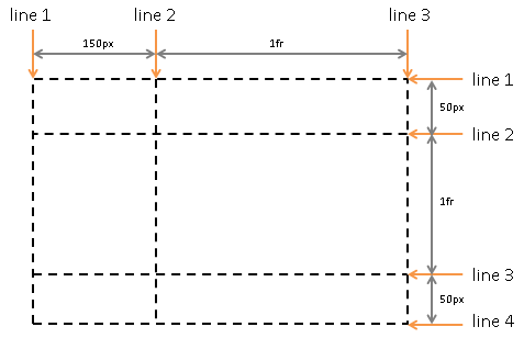
演示了grid lines。
Example 6.1
item1
A
B
C
D
E
F
G
H
要点:
- grid-row-start及grid-row-end分别引用了第1行及第4行的线。
- grid line是单元格的边框线,因此item1单元格共跨3行。
Example 6.2
item1
A
B
C
D
E
F
G
H
要点:
- grid-column及grid-row分别引用了命名的grid line。
Example 7
A
B
C
D
E
F
要点:
- grid line: grid的水平及垂直分割线,也即每个grid row的上下边线或每个grid column的左右边线。